3D Motion
|
클라이언트
LEOLAP
기간
2023.02-2023.03
작업 범위
작업자
Designer MAX/NOAH

LEOLAP is a design-based service generator that runs businesses to expand the startup ecosystem.
Starting with service design, we run businesses in all areas involved in the creation and growth of new services.
리오랩은 스타트업 생태계 확장을 위한 사업들을 운영하는 디자인 베이스의 서비스 제너레이터 입니다.
서비스 디자인을 시작으로, 새로운 서비스의 생성 및 성장 과정에 관여하는 모든 분야의 사업을 운영합니다

In the ideation process of the introduction of the landing page, three elements were derived: grid, separation ,and contrast. The main background is in the form of a grid, and the process of being separated into various sizes and the contrast of each block are configured differently, and the emphasis on the main block is planned to leave a strong impression of the LEOLAP.
랜딩페이지의 도입부의 아이디어화 과정에서 격자, 분할, 대비의 세가지 요소를 도출하였습니다. 주 배경은 격자 형태를 띄며 다양한 크기로
분리되는 과정과 각 블록의 대비를 달리하여 구성하였고, 메인 블록의 강조를 통하여 리오랩이라는 브랜드의 인상을 강하게 남기도록
기획하였습니다.
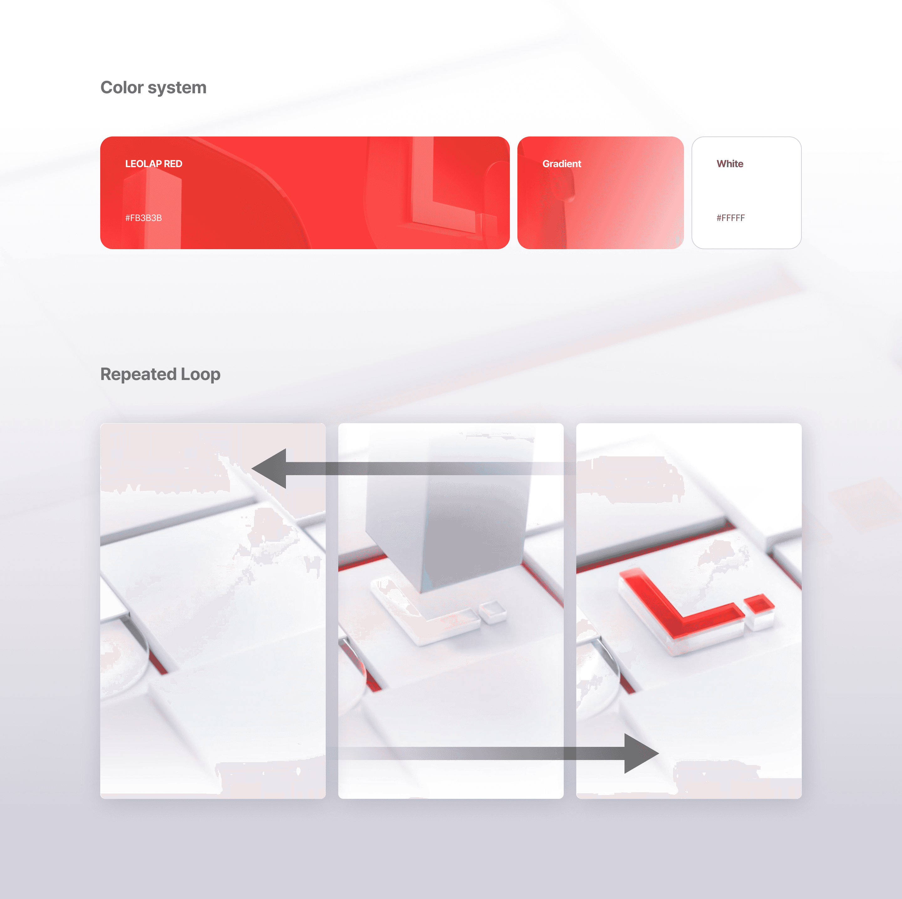
We have detailed the main concept by setting the concept of the landing page to white, red, and repeat animation.
The background color was designated in white, which means creative ideas and new services, and the contrast was constructed through the height of each block.
LEOLAP's identity, which constantly helps with the entire process of the new service, was represented by a red logo and a Looping animation.
랜딩페이지의 구성 요소를 화이트, 레드, 반복 애니메이션으로 정하여 메인 컨셉을 구체화하였습니다.
배경색은 창의적인 아이디어들과 새로운 서비스를 의미하는 흰색으로 지정하고 각 블록의 높낮이를 통해 대비를 구성하였습니다.
새로운 서비스의 전 과정을 끊임없이 돕는 리오랩의 아이덴티티는 빨간색 로고와 전체적으로 반복되는 영상으로 나타내었습니다.
Overview
LEOLAP currently supports the growth of its services through a total of six internal brands. We tried to each brand asset to look unified and unique through business identities and roles.
리오랩은 현재 총 6개의 내부 브랜드를 통해 서비스의 성장을 돕고있습니다. 각각의 에셋들은 브랜드별 비즈니스 정체성과 역할을 담아 통일성있고도 개성있게 보여주려 노력하였습니다.
