UXUI
|
클라이언트
Chappy
기간
2023.11 - 2024.02
작업 범위
프로덕트 기획 / UI 디자인
작업자
Director HARA Designer ZULY/CHOI

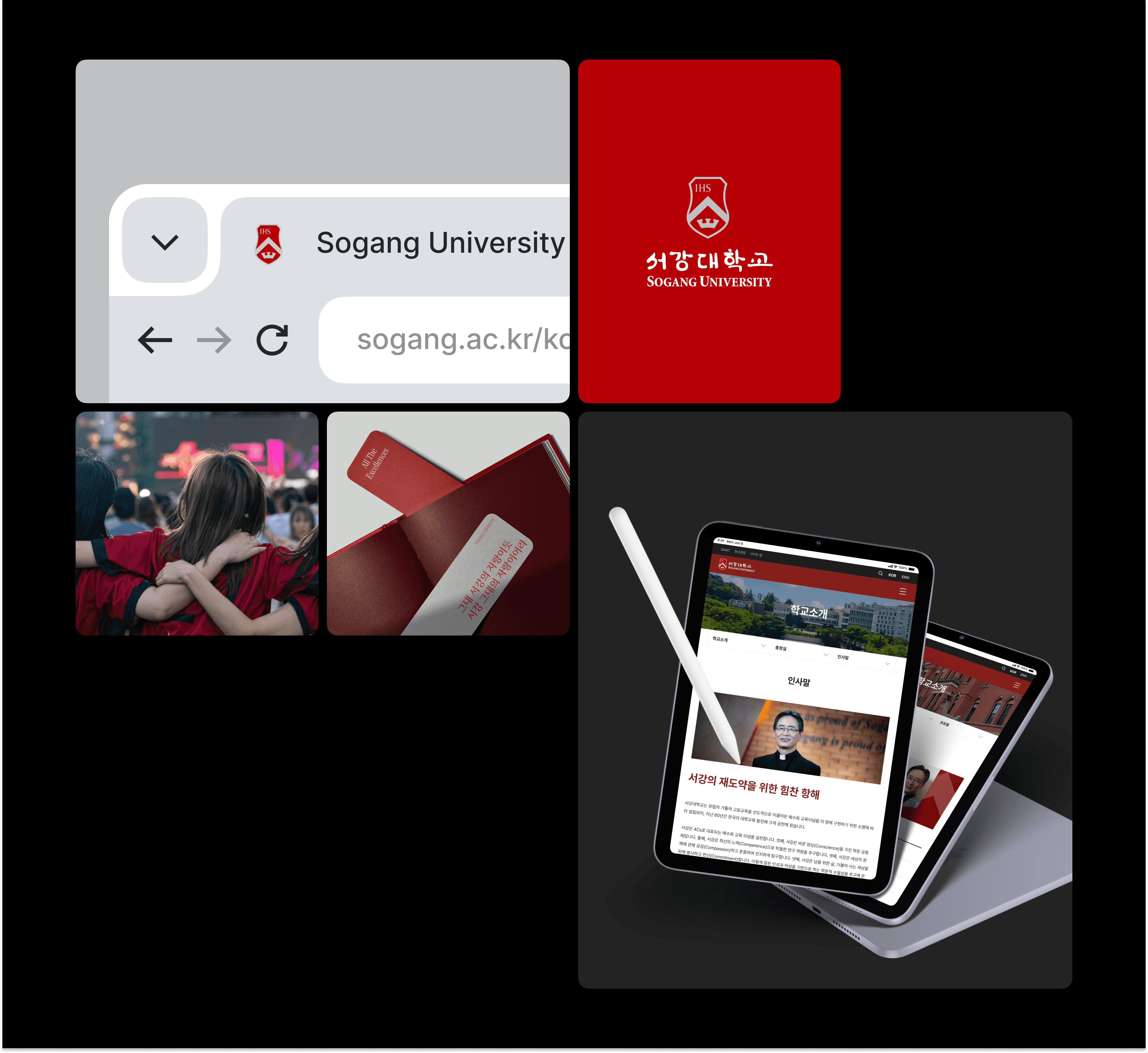
서강대학교의 이미지 및 대외 홍보 효과를 높이기 위해 국·영문 홈페이지를 개편했습니다. 사용자 만족도를 향상시키고 관리자들의 관리 효율성을 강화할 수 있는 기능을 추가했으며, 다양한 IT 기기에 대응하는 반응형 웹을 구축하여 모바일 버전도 크게 개선했습니다. 또한, 교내 소식, 연구 성과, 공지 사항 등 중요한 정보를 사용자에게 효과적으로 전달할 수 있도록 정보 구조를 최적화했습니다.
Sogang University's website has been reorganized to enhance its image and public relations effect. It has added functions to improve user satisfaction and enhance management efficiency of managers, and has also greatly improved its mobile version by building a responsive web that responds to various IT devices. In addition, we have optimized the information structure to effectively deliver important information, such as in-school news, research results, and announcements to users.

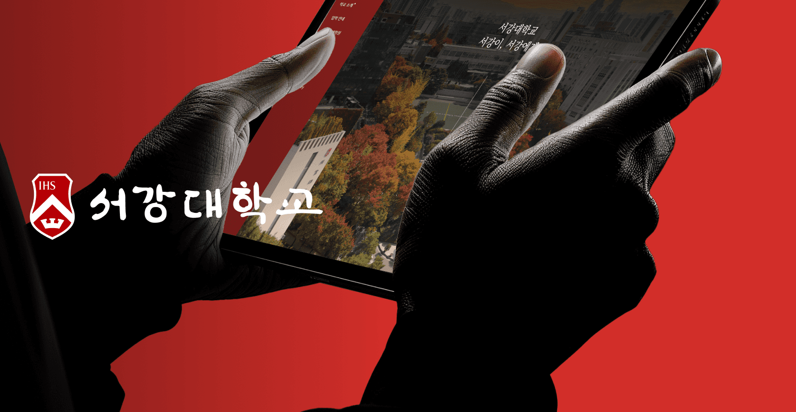
반응형 디자인으로 어디서든 보기 편하게 디자인하였습니다.한국 사회에서 가장 많이 사용하는 사이즈인 1920px부터 대학생들이 많이 사용하는 태블릿 768px, 핸드폰으로 보기 편한 375px까지 어떤 화면에서든 편하게 접속할 수 있습니다.
The responsive design makes it easy to see anywhere. From 1920px, the most commonly used size in Korean society, to 768px, a tablet often used by college students, to 375px, which is easy to see on a mobile phone, you can easily access any screen.

홈페이지 리뉴얼을 진행하면서 영역별로 콘텐츠를 시원하게 분리해 가독성을 높였고, 사용자가 직관적으로 원하는 정보를 찾을 수 있도록 개선했습니다. 학교 주요 행사들을 노출 시켜 학생들이 자주 확인하는 일정 정보를 메인에서 바로 볼 수 있게 하여 편의성을 높였습니다. 서강대 SNS와 캠퍼스 투어 정보도 메인 화면에서 접근 가능하게 만들어 사용자 참여도를 높이는 동시에, 웹사이트를 더 역동적이고 현대적인 느낌으로 바꿨습니다.
During the home page renewal, the content was coolly separated by area to increase readability, and the improvement was made so that users could intuitively find the information they wanted.
By exposing major school events, it has increased convenience by allowing students to see schedule information frequently checked on the main page.
Sogang University's SNS and campus tour information were also made accessible on the main screen to increase user participation, while changing the website to a more dynamic and modern feel.
세션을 명확히 구분하고, 타이틀과 본문의 텍스트 크기를 적절히 조정하며 문장 간격을 뎁스에 따라 재정리하며 깔끔한 디자인을 제공했습니다.
정보의 흐름을 직관적으로 파악할 수 있어, 혼란 없이 내용을 읽고 이해할 수 있도록 가독성을 개선했습니다.
We clearly distinguished the sessions, appropriately resized the text size of the title and body, rearranged the sentence spacing according to the depth, and provided a clean design.
By intuitively grasping the flow of information, we have improved readability so that you can read and understand the content without confusion.

캠퍼스 투어를 별도의 페이지로 분리하여 신청할 수 있도록 개선했습니다. 한 페이지에서 예약 가능일, 시간, 신청 가능한 인원수를 한눈에 확인할 수 있어 편리함을 더했습니다.
It has been improved so that you can apply for the campus tour by separating it into separate pages. It has added convenience by allowing you to check the available date, time, and number of applicants at a glance on one page.
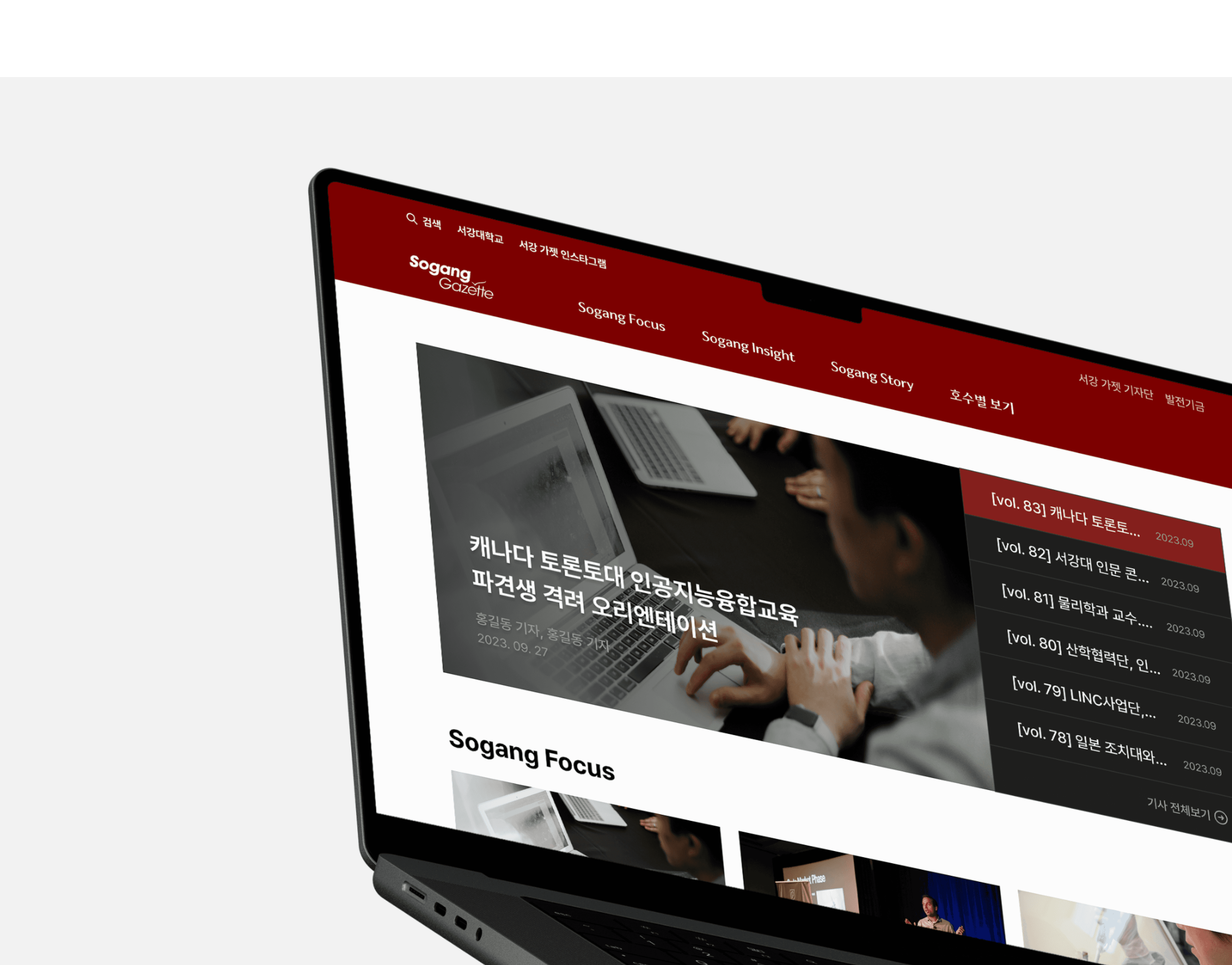
서강 가젯 메인 홈 페이지는 많은 내용이 나열되어 정보 과다로 느껴지는 페이지였습니다. 리뉴얼을 하여 관련 항목들을 그룹화하고 레이아웃을 재구성해 가독성을 높였으며, 보기 좋고 직관적인 디자인으로 사용자 경험을 개선했습니다.
The Sogang Gadgets main home page was a page with a lot of content listed and felt like an excessive amount of information.
During the renewal, related items were grouped and the layout was reorganized to increase readability, and the user experience was improved with a good-looking and intuitive design.
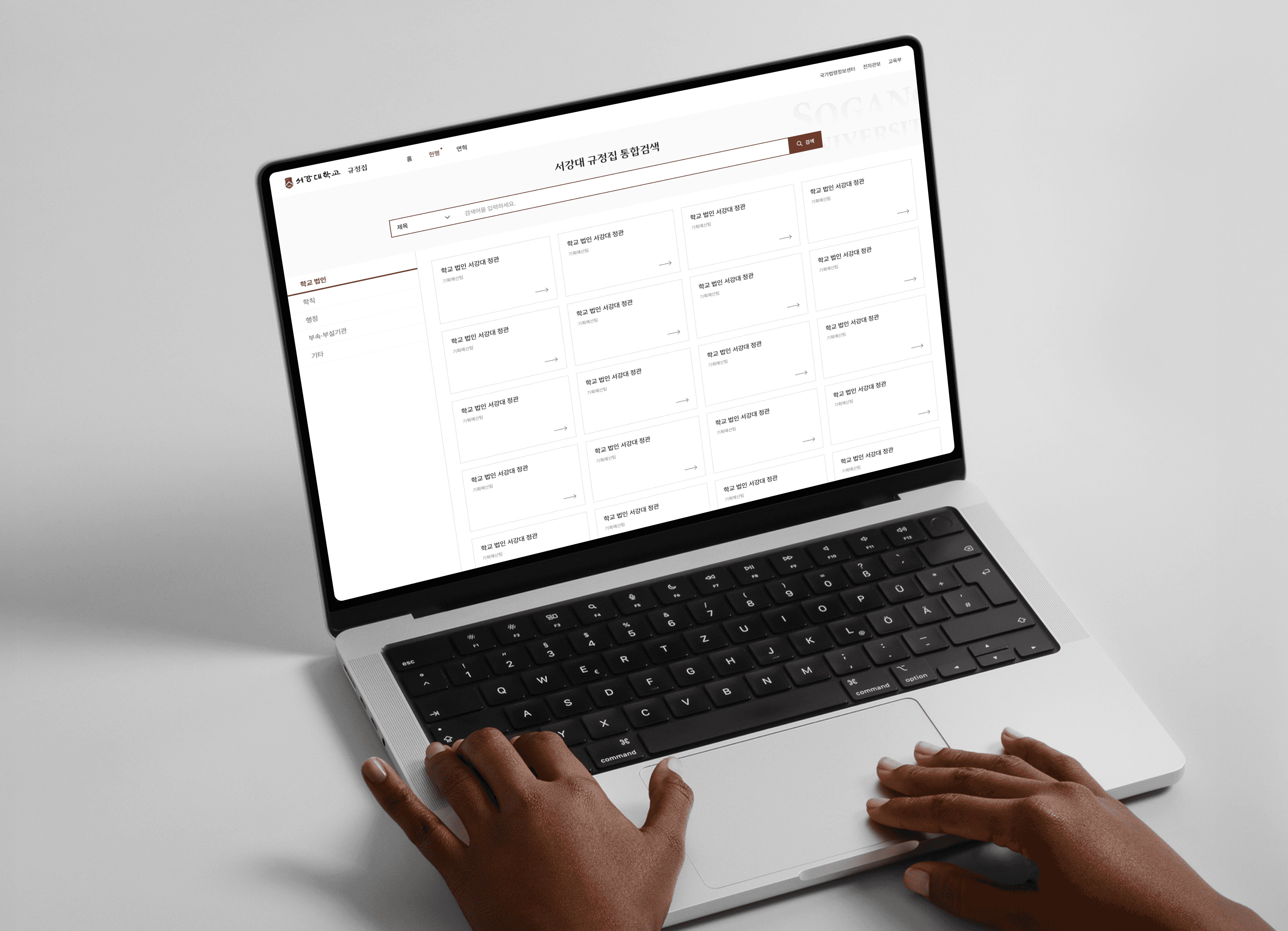
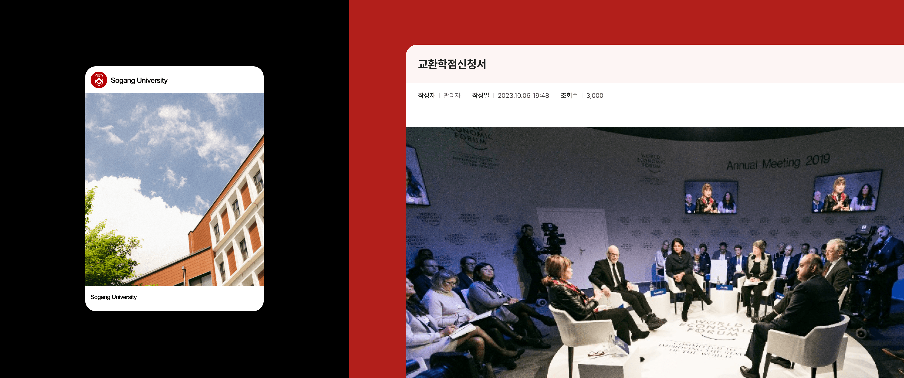
기존 규정집은 각 페이지마다 첨부파일을 하나씩 다운받아야 하는 번거로움이 있었습니다. 규정 내용을 목록화하여 한눈에 볼 수 있게 했고, 상세페이지에서 PDF 뷰어로 바로 내용을 확인할 수 있도록 개선해 사용자 편의성을 크게 향상시켰습니다.
The existing rulebook had the hassle of downloading the attached file one by one on each page.
The regulations were cataloged and viewed at a glance, and user convenience was greatly improved by improving the content to be checked directly in the PDF viewer on the detailed page.